We have rebranded (cheers heard in the distance)! We have a new website and a new logo! As is tradition, a blog post full of SEO jargon and management-speak must follow. Strap in.
We worked with Manchester-based, web-design company Webpraxis to overhaul our existing site with a clean, modern design, and an emphasis on user experience.
We wanted users to understand what we do as quickly as possible, and to have the price points readily available to tie everything together.
We achieved this by including pricing information throughout the site and stripping back the pages to leave nothing but essential text, and where additional information is required it is presented using graphics or graphical tables and icons.
We have new, interactive tools on the homepage where users can search our UK Geographic Number area code pool and check out how much it costs to call destinations with Packnet. And a clearly defined Prices and Features section.
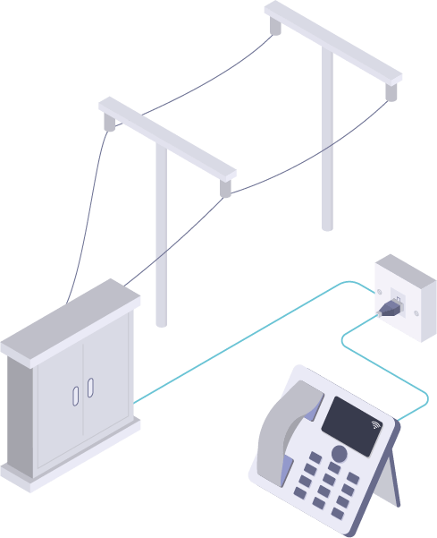
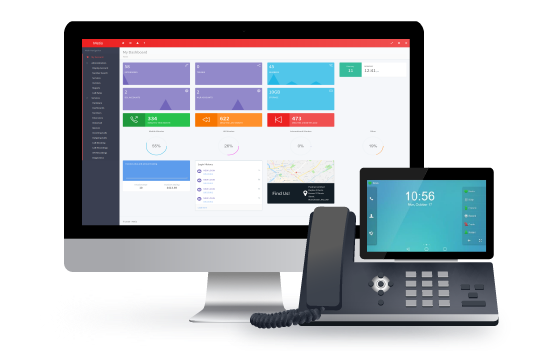
Webpraxis did a quality job with the design and the new imagery. We have impressive 8-bit inspired graphics scattered throughout the site. A couple were so good that they tricked our website team into thinking they were actual pictures. Here are some of our favourites:

SIP Trunking. A little abstract but very satisfying.

Phone Lines. Look at those dainty little cables.

Is it real? I can’t tell anymore.
As with any rebrand, there is a bit of vanity involved. We decided it was time for a new logo and Webpraxis delivered.

The new logo includes our name (unsurprisingly), a new tagline and the letter P! The “letter” itself is actually a representation of a P (I told you this would get pretentious) and the ever-lasting line structure combines the concepts of infinity and a smooth, unlimited, flexible service.
This is the first of many steps we’ll be taking to improve the self-serve aspect of our telephony and reseller services.
About Webpraxis
WebPraxis is a Manchester-based web design and online marketing agency.
Their goal is to help your company develop its online brand, and search engine exposure through high quality bespoke web design, development and online marketing.


